
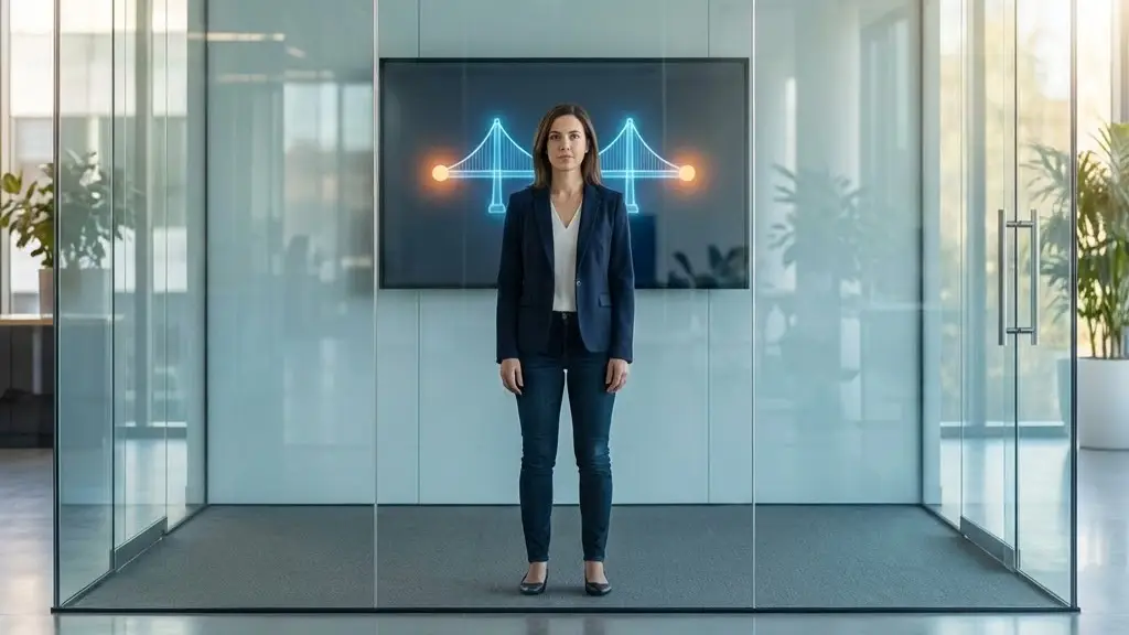
In the high-stakes digital economy of 2026, there is a specific kind of “dark matter” that exists inside every software company. It’s invisible, it doesn’t show up on your Jira board, and it’s the primary reason users abandon products within the first thirty seconds. We call it The Gap.
The Gap is the distance between what a company intends to build and what the user actually experiences. A designer intends for a checkout flow to be “sleek.” A product manager intends for the value proposition to be “crystal clear.” But as we’ve learned, users don’t see intentions; they only see what’s on the screen. Usability testing is the silent truth-teller that makes this gap visible, often with brutal honesty.
The “Curse of Knowledge”
Why does this gap exist in the first place? It’s rarely due to incompetence. Instead, it’s caused by a psychological phenomenon known as the Curse of Knowledge. Once you know how a system works, it becomes physically impossible to remember what it was like not to know.
The people building the product are “insiders.” They know that the hamburger menu contains the settings. They understand that “Submit for Provisioning” means “Create my account.” They have the context of six months of meetings.
A new user, landing on the app for the first time in 2026, has zero context. They are distracted, perhaps they are on a moving train, and they have exactly three seconds of patience.
When a user fails to find a button that the team thinks is “obvious,” the Curse of Knowledge has been exposed. Usability testing acts as a cognitive reset, forcing the team to see their work through the eyes of a stranger.
Testing at Every Stage: From Sketches to Systems
One of the greatest shifts we’ve seen by 2026 is that usability testing is no longer a “final check” before launch. The most successful teams treat it as a continuous dialogue. To close the gap effectively, you have to test at different levels of fidelity:
- The Sketch Phase (Low-Fi): Testing paper wireframes or basic “boxes and arrows.” This is where you test the Information Architecture. Does the user even look in the right place for the “Search” bar?
- The Prototype Phase (Mid-Fi): Using clickable tools like Figma. This is the Validation Stage. Here, you catch the $10,000 mistakes before a single line of code is written. If the flow is confusing in a prototype, it will be twice as confusing (and ten times more expensive to fix) in code.
- The Post-Launch Phase (High-Fi): Testing the live product. This is about Optimization. Why are users dropping off at Step 3? Is there a technical lag or a cognitive roadblock?
Moderated vs. Unmoderated: Choosing Your Lens
By 2026, the methodology has split into two primary paths, each offering a different way to see the gap:
- Moderated Testing: A facilitator guides the user, asking “What are you thinking right now?” This is the “Deep Dive.” It’s incredible for understanding the why behind the behavior. It uncovers the emotional response—frustration, delight, or mistrust.
- Unmoderated Testing: Users complete tasks on their own while their screen and voice are recorded. This is about scale and speed. It tells you “What” is happening across a hundred different users in a single afternoon.
Bridging the Gap with QAlified
This is where specialized partners become invaluable. While traditional QA ensures that the code doesn’t break, usability specialists ensure the experience doesn’t break.
Companies like QAlified have mastered this intersection. They understand that a “technically perfect” system is still a failure if the user is baffled by the interface. By integrating usability testing into the broader Quality Assurance cycle, QAlified helps teams identify these human-facing gaps early. Their approach turns subjective design debates into objective, behavioral data, ensuring that the “truth” of the user experience is heard before the product hits the market.
Transforming Opinion into Evidence
In 2026, the “best” design isn’t the one that looks the prettiest on a portfolio; it’s the one that has the smallest gap between intent and reality.
Usability testing is the only way to stop guessing. It stops the “I think the users will like this” conversations and replaces them with “We saw the users struggle here.” By closing the gap, you aren’t just making a better product; you are respecting your user’s time and intelligence.