
When you spend months building a specific workflow, your brain memorizes the pathway automatically. Real customers never interact with the system using internal documentation or roadmap context. They arrive distracted, skeptical, and highly impatient.
Why does internal jargon kill interface clarity?
When engineering and product teams collaborate inside an isolated environment for months, internal company language starts leaking directly into the UI. Features get overly complex names because they sound innovative during internal roadmap presentations. However, real users do not care about conceptual wording; they want immediate functional clarity.
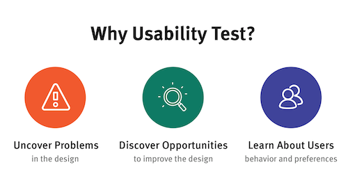
According to internal pre-launch review findings, labels like “Generate Workspace Environment” confuse individuals who simply expect a button that says “Create Project”. Interfaces must prioritize human language over modern internal phrasing to prevent instant cognitive friction.
If an option requires an explanation or a separate video tutorial to be understood, the interface design has already failed its first real test.
How does objectivity disappear during extended development cycles?
Familiarity breeds blind spots within product development squads. After looking at the same settings panel or payment interface hundreds of times, your team loses the ability to perceive flaws. You naturally know where to click because you designed the underlying logic.
This psychological insulation makes teams terrible judges of their own product usability. A systematic user experience review forces the organization to drop its built-in context and view the system from an external perspective.
The moment a team stops questioning obvious pathways is exactly when critical operational blind spots establish themselves permanently.
What can we learn from watching first-time users navigate?
Observing an unconditioned individual interact with your digital product can be a deeply uncomfortable experience for creators. They will openly ignore the massive call-to-action buttons you assumed were impossible to miss. They interpret distinct functional icons incorrectly and tap random dead spaces trying to guess the next step.
- Users routinely skip written onboarding copy and introductory popups entirely.
- Iconography without clear text labels results in immediate navigation errors.
- Complex drop-down structures cause micro-hesitations that stall task completion.
These uncomfortable sessions expose exactly where your team made unfounded behavioral assumptions weeks prior.
How does subtle friction accumulate to ruin product retention?
Product launch disasters rarely happen because of a massive, spectacular system crash. Instead, they occur due to the compounding effect of minor, unaddressed interactive annoyances. A hidden secondary button, a form that asks for repetitive details, or a confusing menu path all act as micro-friction.
Most unsatisfied customers will never reach out to support or open a feedback ticket to describe their issues. They simply exit the session quietly and look for an alternative tool that requires less mental processing power.
Friction accumulates significantly faster than most companies realize, acting as a silent killer of critical early user retention metrics.
Which steps form the core of a pre-launch UX assessment?
Executing a deliberate evaluation before opening the doors to general traffic ensures your system functions under real psychological conditions rather than clean laboratory settings. This requires checking cross-departmental consistency, testing form structures, and validating navigation without assistance. If the product feels difficult to use before providing value, user abandonment occurs instantly.
To secure a seamless market debut, establishing an actionable pre-launch validation strategy prevents premature churn. Prioritizing a structured evaluation before deployment guarantees that technical stability matches user intuition perfectly.
Investing time in evaluating user paths before going live pays massive dividends in long-term customer satisfaction and reduced customer support load.